
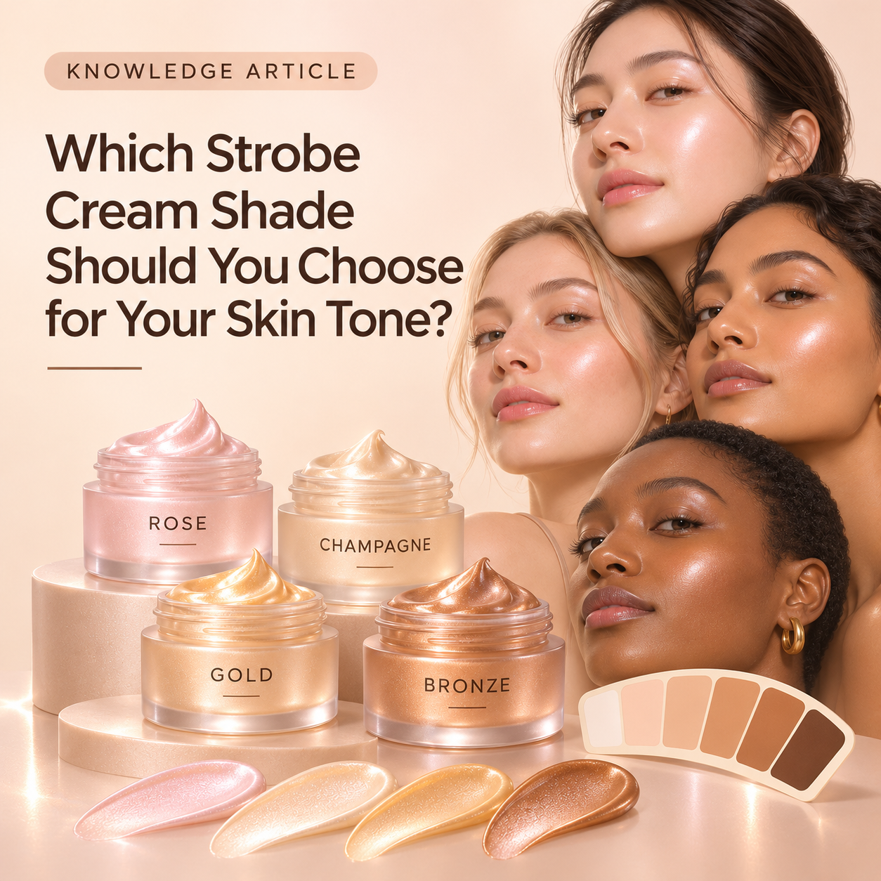
Strobe cream shades are chosen to complement the complexion and the kind of reflection you want. Rose and champagne are discussed for very fair or pink-toned skin, gold for many fair-to-medium complexions, and bronze for deeper skin tones. These are aesthetic starting points, not rigid rules.
What the shades look like
Rose gives a more pinkish reflection. Champagne sits close to gold but with a softer pinkish character. Gold is the most broadly versatile everyday option in my examples. Bronze adds a deeper warmth, and a maroon-leaning nuance can give a blush-like appearance on some deeper complexions.
Why contrast matters
A colour can be attractive in the jar but look too conspicuous on the face. A strong bronze effect on very fair skin may look unnaturally dark, while bright gold can sometimes stand out excessively on a deeper complexion. The objective is not to make every skin tone look golden. It is to choose a reflection that blends visually with the person wearing it.
Can a strobe product be personalised?
Yes, the colour direction can be adjusted. The examples include rose, champagne, gold, bronze and deeper blended tones. What matters to the wearer is the final appearance on their own skin, particularly under the kind of lighting in which the product will be used.
Practical takeaway
Choose the shade by looking at the reflection on the skin, not by assuming the same mica colour suits everybody. A complementary, subtle shine is often more convincing than a bright colour that contrasts with the complexion.