
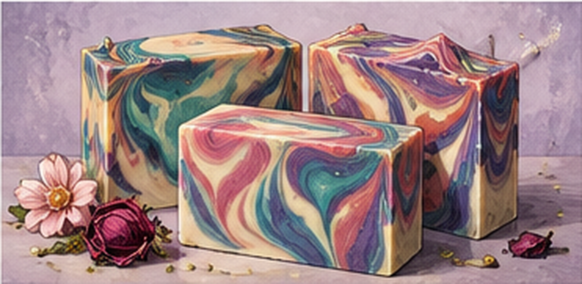
Artistic cold process soap begins with planning, not pouring. A useful starting point is an inspiration image: a photograph, scenery, pastry, colour palette or another visual that can be reduced to a few recognizable elements.
The goal is not to copy every detail. It is to understand what makes the image visually identifiable.
Break the inspiration into visual components
When I look at an inspiration, I ask questions such as:
What are the dominant colours? Where does the image become lighter or darker? Which boundaries should feel straight and which should be irregular? What textures matter? Which small elements make the scene recognizable?
A beach scene, for example, can be understood as sand, surf, water, sky, sunlight and small identifying details such as birds or a coconut tree.
A night scene uses a different visual language: darker water, dark mountains, a night sky, a moon and stars.
Once you begin thinking this way, you are no longer memorizing one soap design. You are learning how to translate an image into colour, gradient, texture and recognizable elements.
Use gradients and texture deliberately
A perfectly flat top is not always the most interesting choice. Uneven surfaces can create movement and reinforce the visual idea.
Colour gradients can also carry meaning. They can distinguish water from sky, suggest the glow around a sun, or move a night sky from very dark overhead to lighter near the horizon.
Artisanal soap is therefore not simply a bar containing several colours. It is closer to planning a small picture inside the soap.
Think about finishing while you design
Stamping can be used as a brand mark or as a decorative element. But it tends to show more clearly on a relatively uniform, uninterrupted area than over a visually busy swirl. That means the location of a stamp is worth considering during design planning rather than only after the bar is finished.
Colour can be incorporated into stamping, but it does not automatically improve the result. In one demonstration, a coloured impression did not look right and was removed and redone without colour.
That leads to an important artistic principle: not every embellishment improves a design. The transferable skill is to learn how to see an inspiration as a set of visual decisions. Once you can do that, the techniques learned from one design can help you imagine many others.